
Surfmeter Dashboard

Your analytics command center for QoE and network quality data.

A web-based platform that brings together all your measurement data — video streaming quality, web performance, speed tests, CDN delivery, and network diagnostics — in interactive dashboards. Detect anomalies automatically, drill into single sessions, and manage your entire probe fleet from one place.

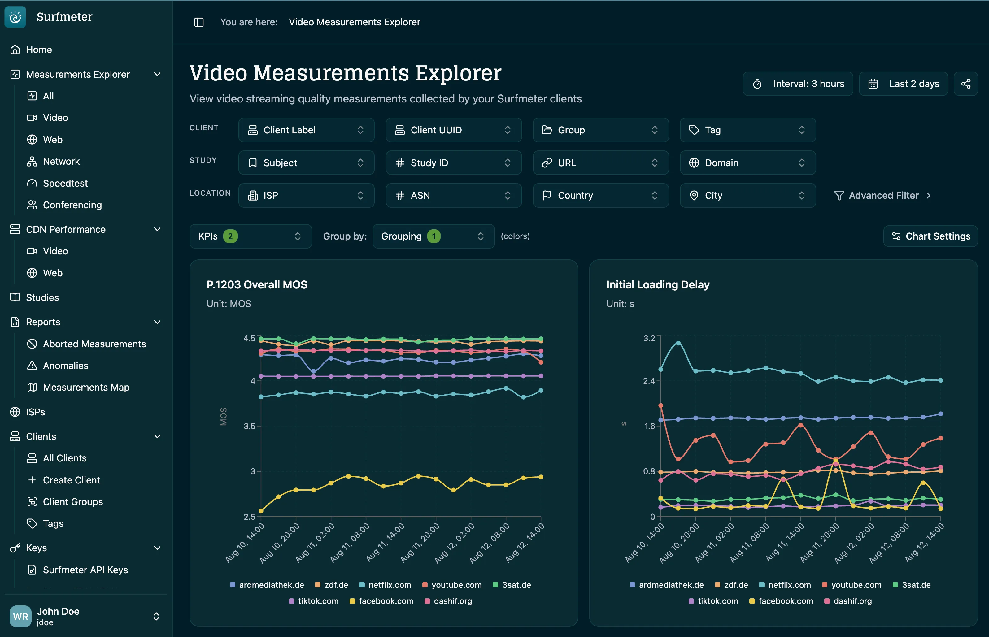
Surfmeter Dashboard showing the Video Measurements Explorer with P.1203 MOS and initial loading delay per streaming service

Product Overview

See everything. Configure everything.

The Surfmeter Dashboard is where measurement data becomes actionable. Browse aggregated KPIs, drill into individual sessions, and filter by client, study, geography, or network. Anomaly detection watches every probe and service in the background and groups related alerts into incidents, so you look at problems instead of noise. On the admin side, manage clients, registration keys, capabilities, and user access from a single interface.

Key Features

What it does

Interactive Measurement Explorer

Browse video, web, network, speed, and conferencing measurements in one place. Filter by client, group, tag, study, URL, domain, ISP, ASN, country, or city, pick the KPIs to plot, and set the aggregation interval and time range — with Lucene queries for anything more specific.
Automatic Anomaly Detection

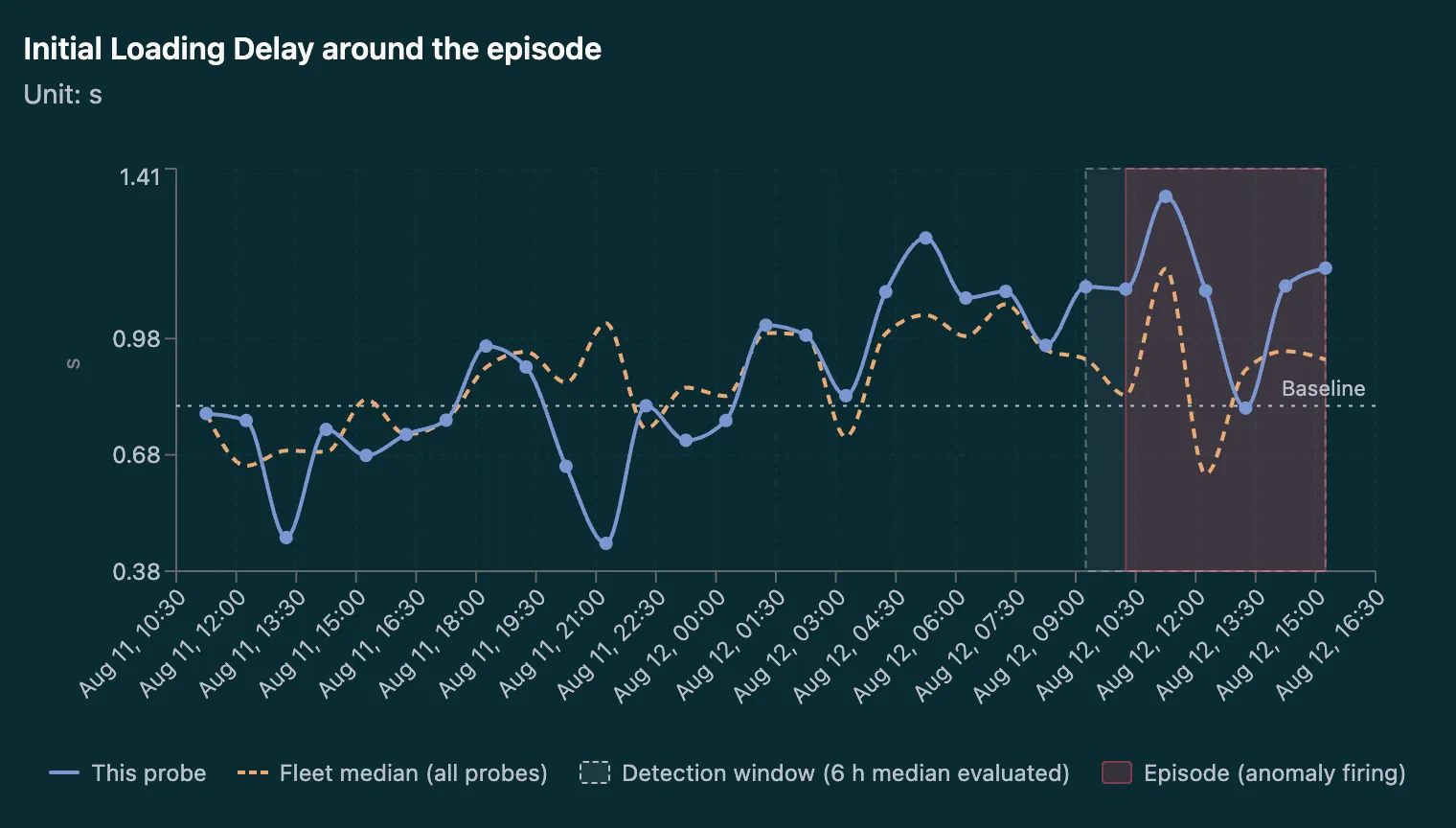
Every probe is compared against its own baseline and against the median of the whole fleet. When a KPI drifts far enough for long enough, the dashboard marks the episode and shows you exactly what changed and when.

Incident Grouping

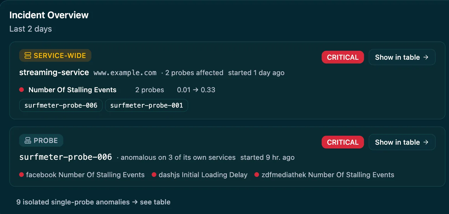
Related anomalies are correlated into a single incident — service-wide when several probes see the same problem, probe-level when one location misbehaves across services. Severity, affected probes, and KPI shifts are on the overview.

CDN Performance Analytics

See response times broken down by content delivery network across the page and video requests of your measurements — Akamai, Cloudflare, Fastly, Google, Amazon, Microsoft, and more — and find out which delivery path is holding quality back.

AI Assistant

Ask questions about your data in natural language. The LLM-powered assistant queries your measurements, explains individual results, and surfaces trends — all context-aware with your current filters and time range.

Administration & Access Control

Manage clients, client groups, tags, and studies. Add users and roles, define measurement capabilities, issue registration and API keys, and track license usage — all from a single admin interface.

Chart of initial loading delay for a single probe compared to the fleet median, with the detection window and the firing anomaly episode highlighted
ANOMALY DETECTION

Know When a Probe Drifts Away From the Fleet

Each KPI is tracked against the probe's own baseline and against the median of all other probes measuring the same service. When the rolling median stays outside the expected range through the detection window, the dashboard marks the episode on the chart — so you can tell a genuine local degradation apart from a problem the whole fleet is seeing.

Incident overview listing a service-wide critical incident affecting two probes and a probe-level incident across three services
INCIDENT OVERVIEW

One Incident Instead of Fifty Alerts

Anomalies rarely happen alone. Surfmeter groups them by what they have in common: a service-wide incident when several probes degrade on the same service, a probe-level incident when one location goes bad across services. Each entry shows severity, how long it has been running, the affected probes, and how far the KPI moved.

Key metrics with color-coded grading and a tooltip explaining that a 3.98 MOS is rated Fair, based on the ITU-T P.1203 standard and P.800 quality categories
QUALITY GRADING

Color-Coded KPI Quality at a Glance

Every key metric is graded with traffic-light indicators — green, yellow, or red — based on scientifically defined thresholds. P.1203 MOS scores, Core Web Vitals, Lighthouse scores, and network KPIs are graded automatically, and each metric explains what it measures and where its thresholds come from, with references to the underlying ITU-T standards and research.

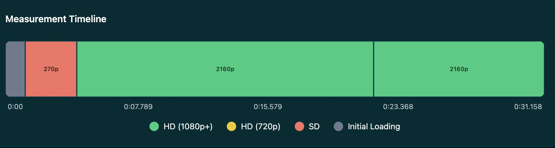
Measurement timeline of a video session showing initial loading, an SD segment at 270p, and 2160p HD playback
SESSION TIMELINE

Detailed Playback Session Breakdown

Every video session becomes an interactive timeline — initial loading, quality switches between SD and HD, and stalling events mapped across the whole playback. You can see at a glance how long a stream took to start, which resolution it settled on, and where the experience broke down.

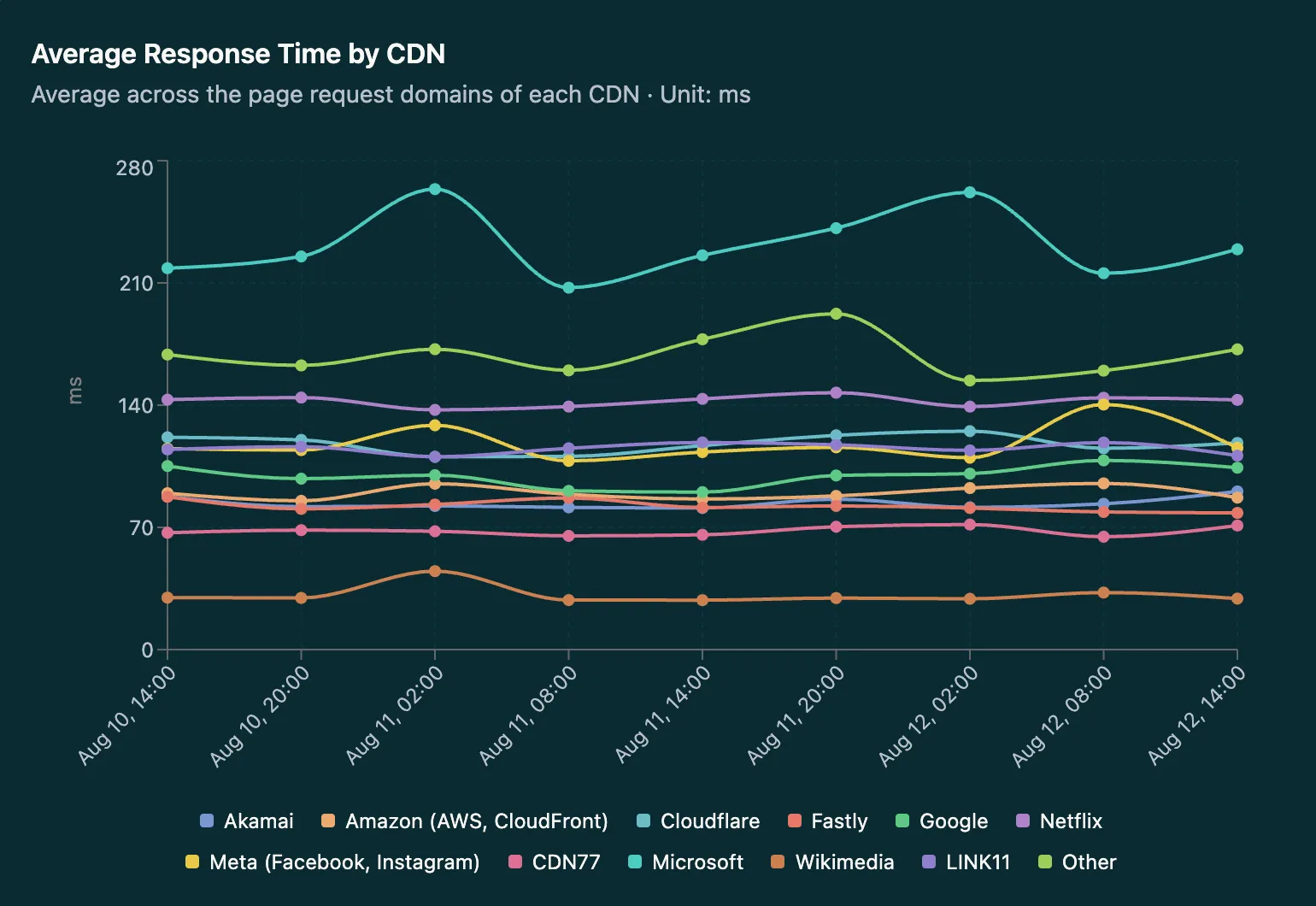
Chart comparing average response time by CDN provider over two days
CDN PERFORMANCE

Find Out Which Delivery Path Is Slow

Surfmeter identifies the CDN behind every request your measurements make and aggregates response times per provider. Compare Akamai, Cloudflare, Fastly, Google, Amazon, Microsoft, Meta, and others over time to see whether a quality drop comes from your own service or from the network delivering it.

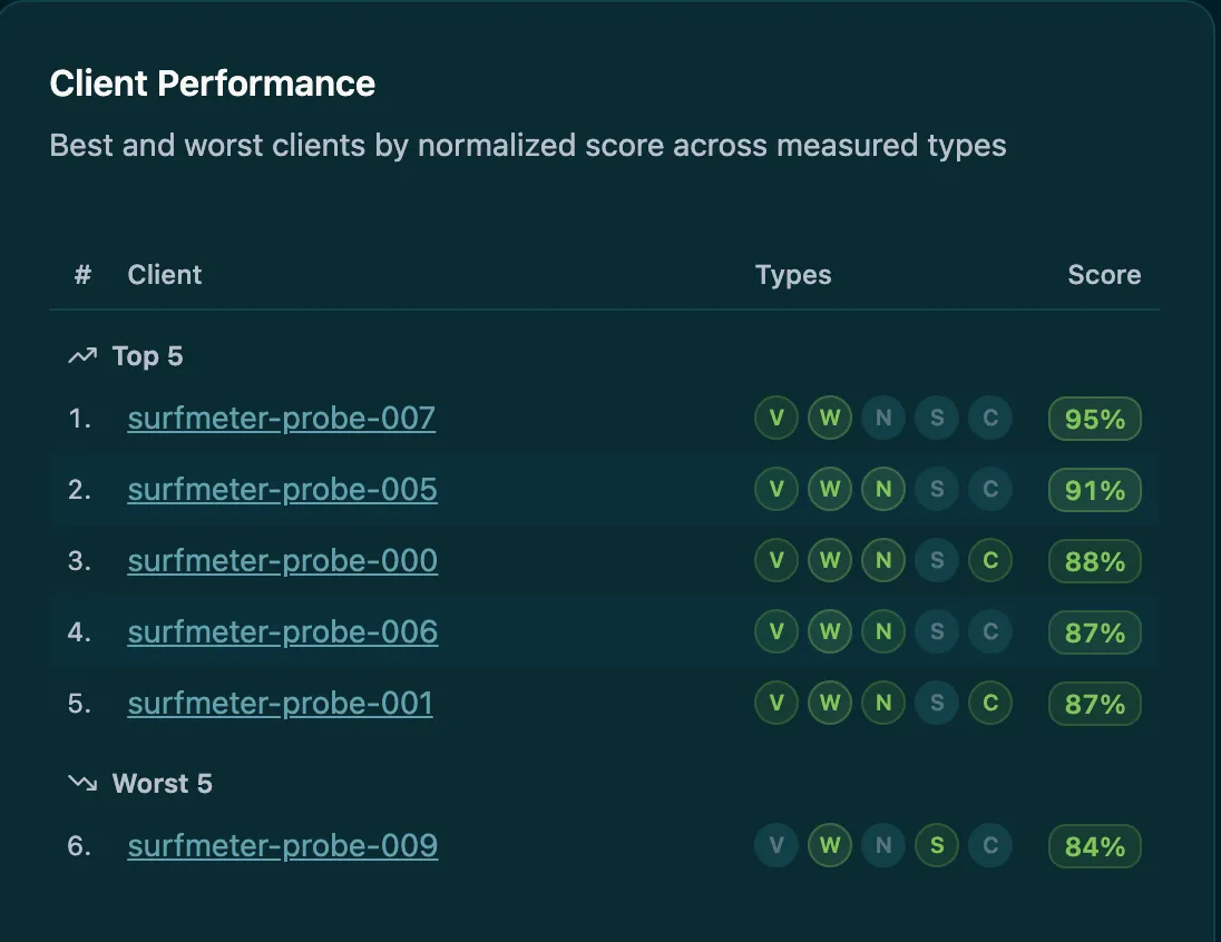
Client performance table ranking the best and worst probes by normalized score across measurement types
FLEET RANKING

Best and Worst Clients, Ranked

A normalized score across all measured types — video, web, network, speedtest, and conferencing — ranks your clients from best to worst. It is the fastest way to see which locations need attention, and which measurement types a given probe is actually covering.

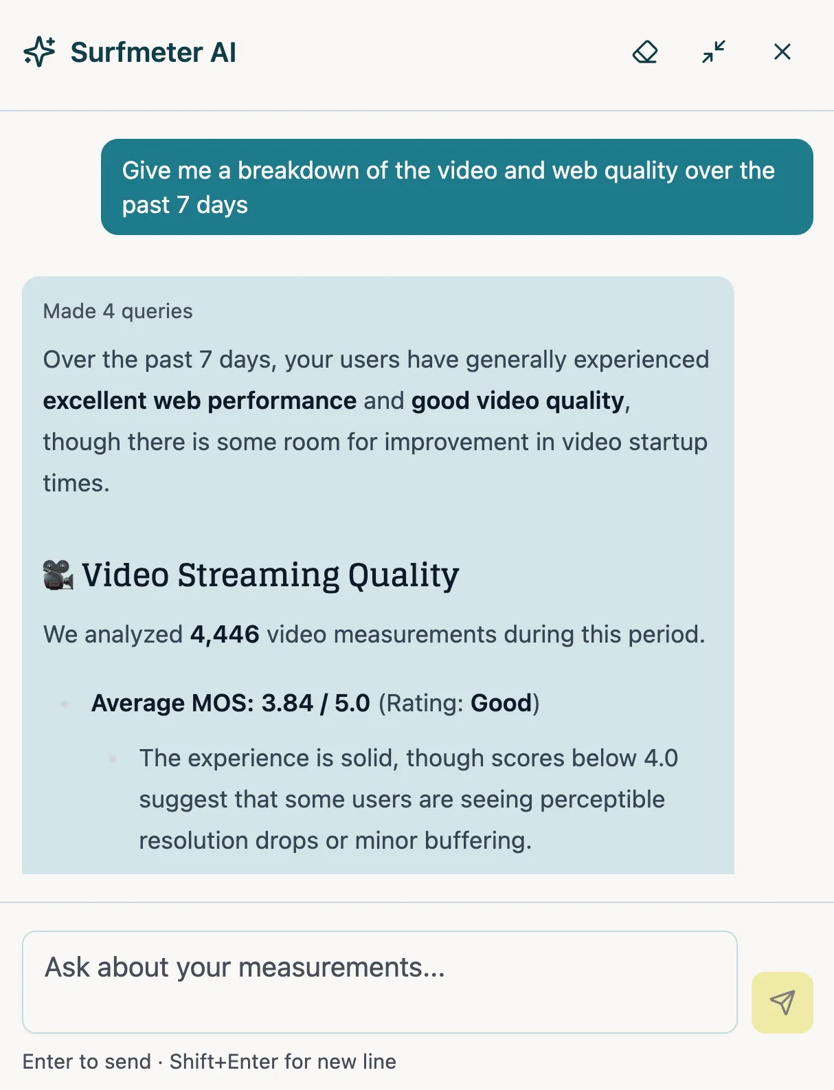
Surfmeter AI chat panel answering a question about video and web quality over the past 7 days with average MOS and a quality rating
AI ASSISTANT

Ask Your Measurement Data a Question

The built-in assistant turns a question in plain language into queries against your own data and answers with numbers you can check — "How was Netflix quality last week?", "Which clients had the most stalling?". It respects your current filters and time range, and one click on any measurement gives you a plain-language explanation of what its KPIs mean.

Ready to see it in action?

Get a personalized demo and see how Surfmeter fits your use case.

How It Works

From data collection to insight in 4 steps

The Dashboard works with data from all Surfmeter products — Automator probes, Mobile SDK devices, and Player SDK integrations.

1

Data arrives automatically

Measurement clients send results to the Surfmeter platform in real time. Data is enriched with geolocation, ISP, CDN, and device context on ingestion.

2

Explore and filter

Use the measurement explorer to browse by type (video, web, speed, network, conferencing), filter by client, study, time range, and any combination of dimensions.

3

Let anomalies find you

Anomaly detection runs continuously against per-probe baselines and the fleet median, and groups what it finds into service-wide or probe-level incidents on the reports page.

4

Drill into details

Open any measurement to see the full session — color-graded KPIs, the playback timeline, and CDN breakdown — or ask the AI assistant a question about your data in plain language.

Data & KPIs

Measurement types and key metrics

Video Streaming Web Performance Speed Tests Network Diagnostics CDN Performance Conferencing Gaming

Video QoE

  • P.1203 Overall MOS
    Perceptual quality score (1–5)
  • Initial Loading Delay
    Time until video starts playing
  • Stalling Events
    Number and duration of stalling
  • Average Video Bitrate
    Average data rate of video stream
  • Resolution & Quality Switches
    How often quality changes mid-stream
  • Video Session Timeline
    Play, pause, and buffer events over time

Web, Speed & CDN

  • Largest Contentful Paint (LCP)
    Time until main content is visible
  • First Contentful Paint (FCP)
    Time until first content appears
  • Cumulative Layout Shift (CLS)
    Visual stability during page load
  • Download / Upload Speed
    Maximum throughput in both directions
  • Latency (RTT)
    Round-trip delay to server
  • CDN Provider
    Response time per delivery network

Platform & Context

  • Client & Device Info
    Device, OS, and app metadata
  • Geolocation & ISP
    Location and provider enrichment
  • Network Technology
    Connection type (WiFi, 4G, 5G, …)
  • Study & Grouping
    Organize measurements by campaign
  • License & Usage Tracking
    Active clients and quota usage

Use Cases

Who it's for

NOC & Operations Teams

Monitor live quality across your probe fleet. Set up filtered views per region, service, or client group, and let the incident overview tell you what needs attention right now.

Quality Engineers

Drill into individual measurements, inspect video session timelines and CDN response times, and use the AI assistant to quickly interpret complex KPI patterns.

Management & Reporting

Access aggregated quality trends, client rankings, license usage summaries, and shareable filtered views for stakeholder reporting.

Platform Administrators

Manage the entire Surfmeter deployment — users, clients, registration keys, capabilities, and API access — from a single interface.

Proven in Practice

Tier-1 Operator Network Benchmarking

See Your Data Come to Life

Get a walkthrough of the Surfmeter Dashboard and see how it turns raw measurements into actionable insights.

By contacting us, you agree to receive occasional email updates from us about our products or features.