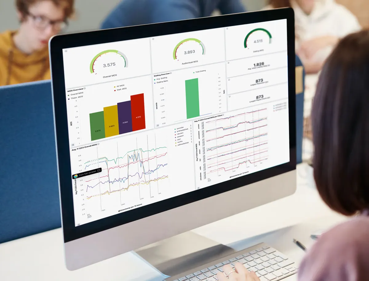
 Do you have a good MOS for your video streams?
Do you operate a streaming service and want to understand how your offering compares against competitors? Are you a network operator who needs to know whether OTT platforms operate well for your customers?
Set up our dashboard for different services, OTTs, ISPs, content streams — and start monitoring! Our analytics suite will give you three unique features:
- A composite MOS — to understand the overall service quality at a glance. We use advanced QoE models to calculate the MOS for video streams.
- All the important KPIs — to be able to drill down to pinpoint issues. All the metrics are there, such as stalling or video resolution and bitrate.
- Direct comparisons between services and operators — easily configurable to show what you need.
Read on to find out more about how you can set up our dashboards to your liking. In this post we’ll focus on video streaming.
Let’s compare multiple providers
If you are an OTT provider, you likely have insights into your own streams already, for instance through client plugins. (If you don’t, you should talk to us!) Our Surfmeter measurement solution is not restricted to your own services though — we can integrate measurements of your competitor too. This allows us to directly compare the quality and performance from the same context. So when we compare multiple providers, it starts to get really interesting.
Let’s start with an example, where we’ve set up a test in which we compared four streaming providers that all streamed the same linear TV channels through a web interface. Due to licensing restrictions we know that some of those channels were DRM-protected, and some were not. We measured, among other KPIs, the initial loading delay of the video, as a proxy for overall quality. The graph below shows the average loading time in seconds, over the course of several days. It clearly shows the increased loading timesProvider A has with DRM streams. If you were Provider A, you would have reason to act, while as Provider C you would see your strength compared to A and B.
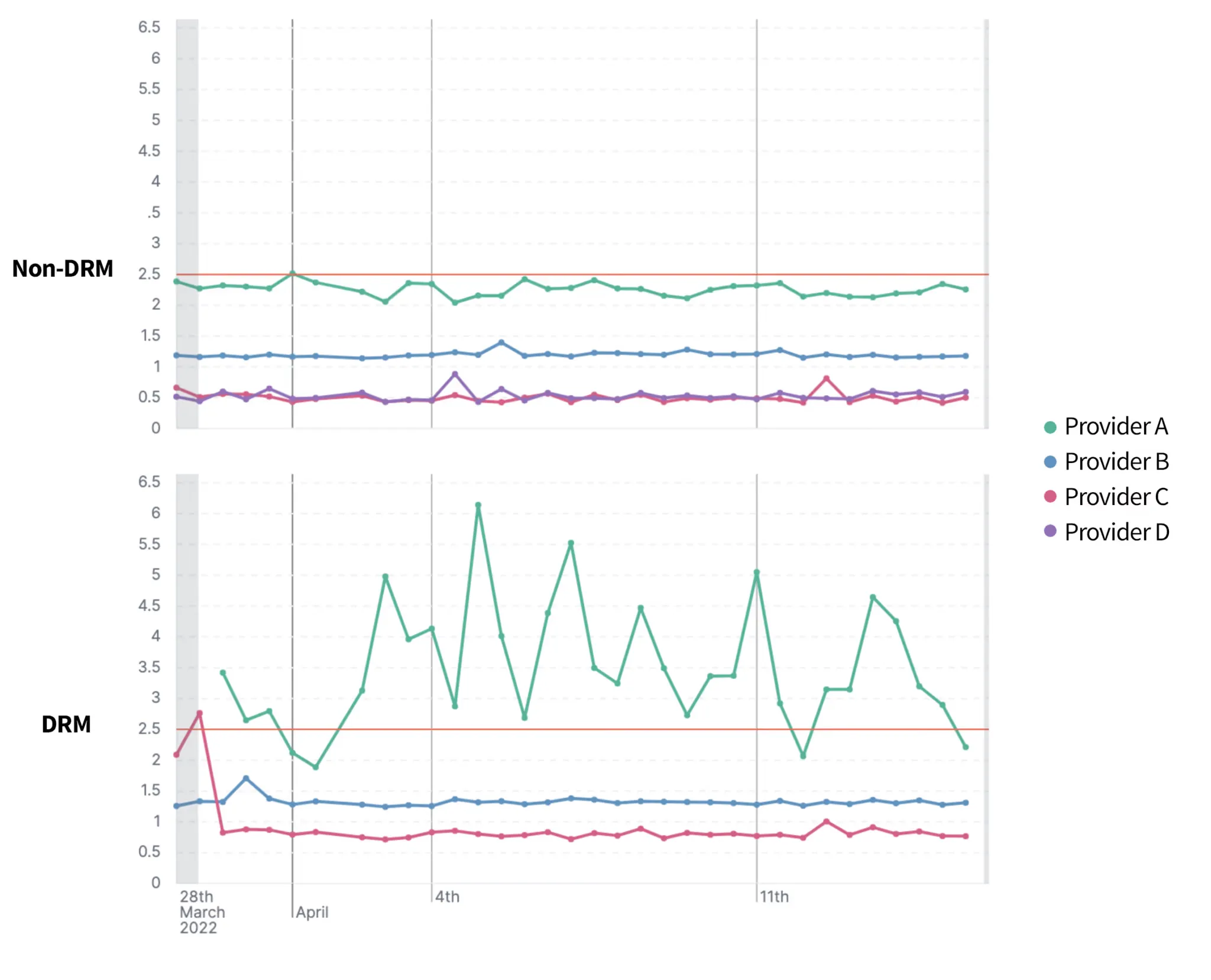 Comparison of multiple providers utilizing both DRM-protected and non-DRM streams.
Below, you can see another example from our dashboard — an overview of various MOS indicators. Look at the top left gauge: the overall MOS has dropped to below 3, which indicates badly performing streams. This confirms: Provider A needs to act, as the experience for DRM protected streams is less than ideal, with long initial loading times. Looking at the bottom right, we can see that resolution was also capped at non-HD, which users may perceive as suboptimal.
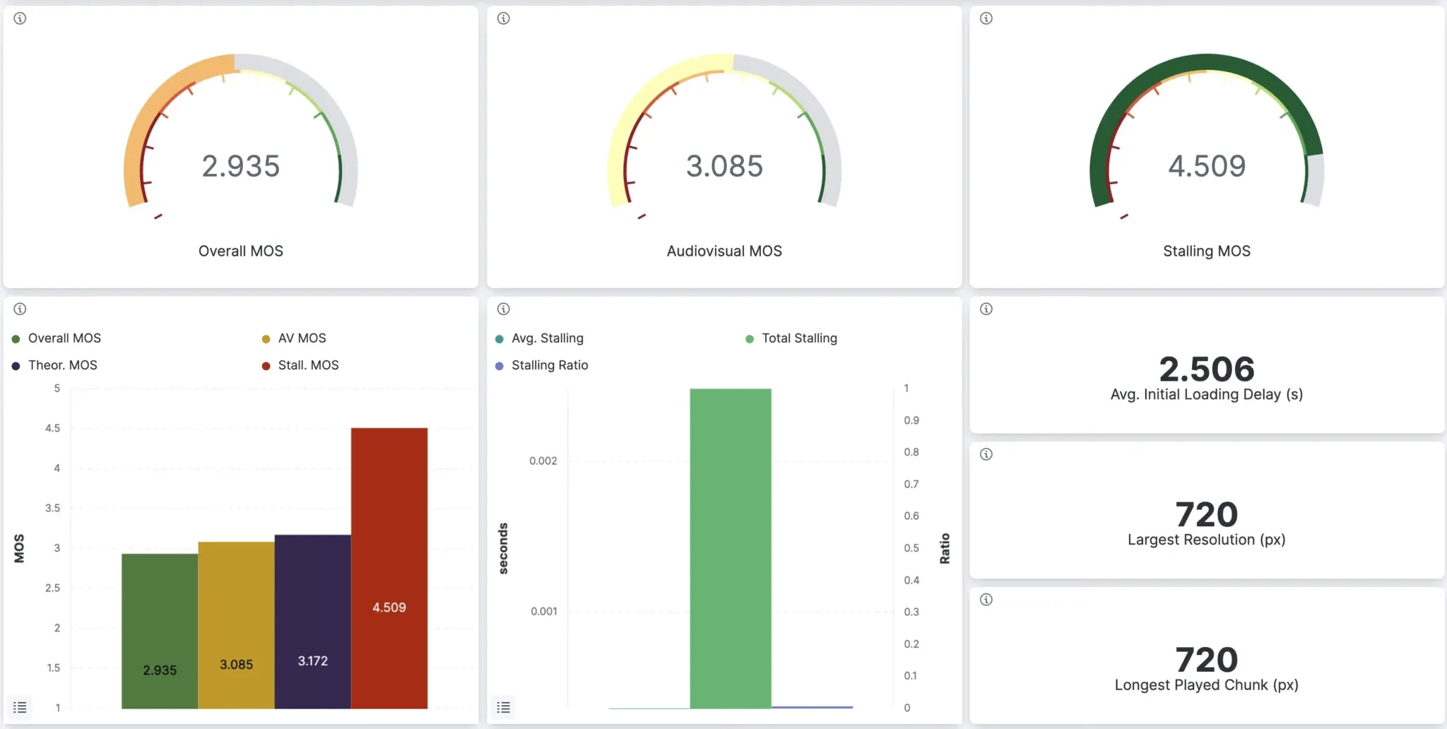 Bad MOS calculated for provider A – something needs to be done before customers leave
As you can see below, our dashboard also allows you do filter by OTT provider or device — and those are just examples. We can fully customize the available filter options, enabling you to not only perform general comparisons, but also see detailed charts for selected services or test devices.
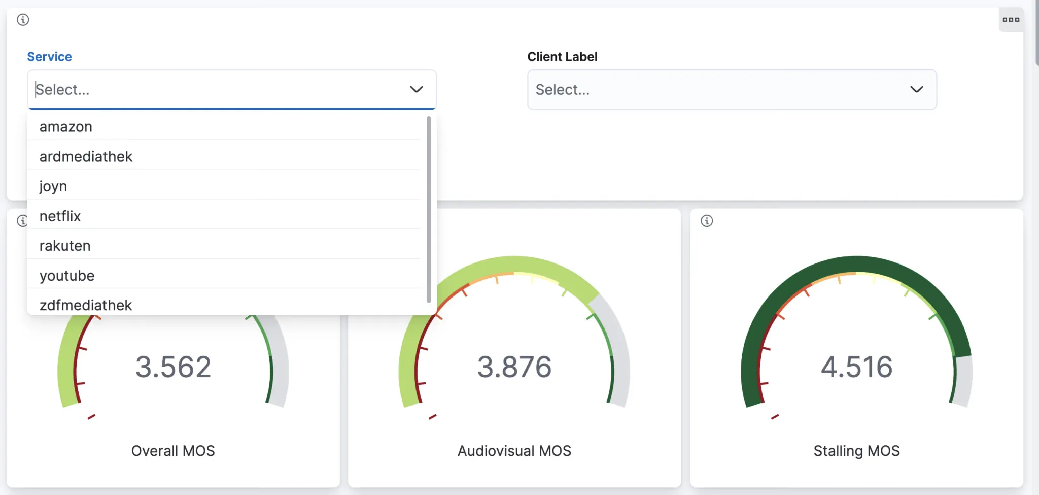 Filtering by service or client ID is included.
Let’s compare multiple providers
Here is another demo of our Surfmeter Analytics Dashboard capabilities — again, we’re looking at the initial loading delay of two OTT providers directly compared. In the graph below, each colored line represents one monitoring probe equipped with Surfmeter Automator. All probes measure a video from both providers every few minutes, enabling us to check what the typical performance is.
Each monitoring probe uses a different connection speed, meaning that we can see the impact of download/upload bandwidth on the results. The green and blue lines correspond to probe with 16 or 50 MBit/s DSL connections, and the purple line has a 1 GBit/s fiber access. The differences are considerable: video service provider A requires a much longer loading time until a video starts to play — up to 10 seconds or more. For provider B, the loading delay can be kept almost constant at an agreeable 2.5 seconds.
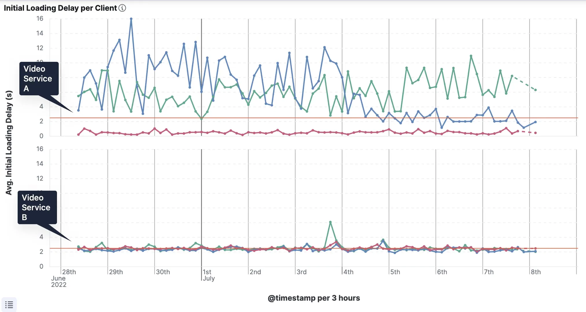
We can see that the design of video services strongly impacts the customer-experienced quality, depending on the available bandwidth. Providers with efficient caching and service design may be able to start streaming much earlier.
Released now: Service Comparison Dashboard as part of our Surfmeter product
As you could see above, good visualizations help you understand how well different services operate. We’ve been working on our Analytics Dashboard for a while — and you can get it with any Surfmeter client application.
Our comparison dashboard lets you compare QoE data for different providers, streams, and devices. It gives you all the important KPIs, and, in addition, a single MOS for the video streaming experience. If you’re an OTT provider, you can get detailed insights into your offering and your competitors, enabling you to improve certain aspects (like service loading times). Or, if you are an ISP, you’ll receive an overview of representative OTT services that get streamed on your network.
Here are the main benefits:
- Quickly see how your service and streams compare against competitors.
- Detect service degradation in a timely manner.
- Act before your customers complain and reduce churn.
- Know where to spend effort to provide the best service.
You want to see a demo? Get in touch
But wait … there’s more
Streaming is a top priority for most providers, as users are spending more and more time consuming video online. But that’s not the full picture: underlying network performance metrics are vital for understanding the reasons behind application-level service failures. In the next posts, we’ll have a deeper look at web page performance tests, ping and DNS resolution measurements, and speed tests.
Standards-backed solutions and custom integrations — how can we help you?
Do you have competition and want to know how well customers perceive your streams? At AVEQ we don’t just have ready-to-go solutions for measuring streaming video quality, but also the expertise needed to develop custom applications for your use cases.
In the end, the user’s satisfaction is what matters, and you can only quantify that with the right tools at your disposal. Getting a single quality score through the use of QoE models can tremendously help in operationalizing your new service and reacting immediately to service issues. We’re constantly exchanging with standards bodies and forums like ITU-T and VQEG to deliver you the newest in terms of automated QoE measurements.
Don’t hesitate to get in touch with us if you want to find out more — we’d like to hear from you!