
Measuring CDN Performance with Surfmeter’s New CDN Analysis Tool
Seamless web browsing isn’t just a convenience; it’s a fundamental expectation by end-users in our connected world. For Internet Service Providers (ISPs) and network operators, delivering a fast, responsive online experience is important to customer satisfaction and retention. When web pages lag or videos buffer endlessly, subscribers don’t just get frustrated—they start looking for alternatives.
But here’s the challenge: a modern webpage is rarely a single, monolithic entity. It’s a complex set of content delivered by multiple sources. Your favorite news sites, shopping platform, or streaming service likely pulls in text, images, scripts, and video from various Content Delivery Networks (CDNs), each optimized for different types of content or geographic regions. The overall loading performance and the perceived user experience depend on the coordinated delivery from all these CDNs. If even one of them fails, the entire experience can suffer.
At AVEQ, we’re constantly pushing the R&D envelope to give you deeper, more actionable insights into this aspect. That’s why we’re thrilled to roll out a powerful new CDN analysis feature within our Surfmeter platform, designed to help you diagnose and tackle these very challenges head-on. Read on to find out more!
What Surfmeter’s CDN Analysis Can Do For You
Let’s directly take a peek at what you can now do with Surfmeter’s new CDN analysis. Here’s a chart of the domains loaded when you browse to https://netflix.com — in the case of the below data, it’s from a series of measurements performed with our Surfmeter probes.
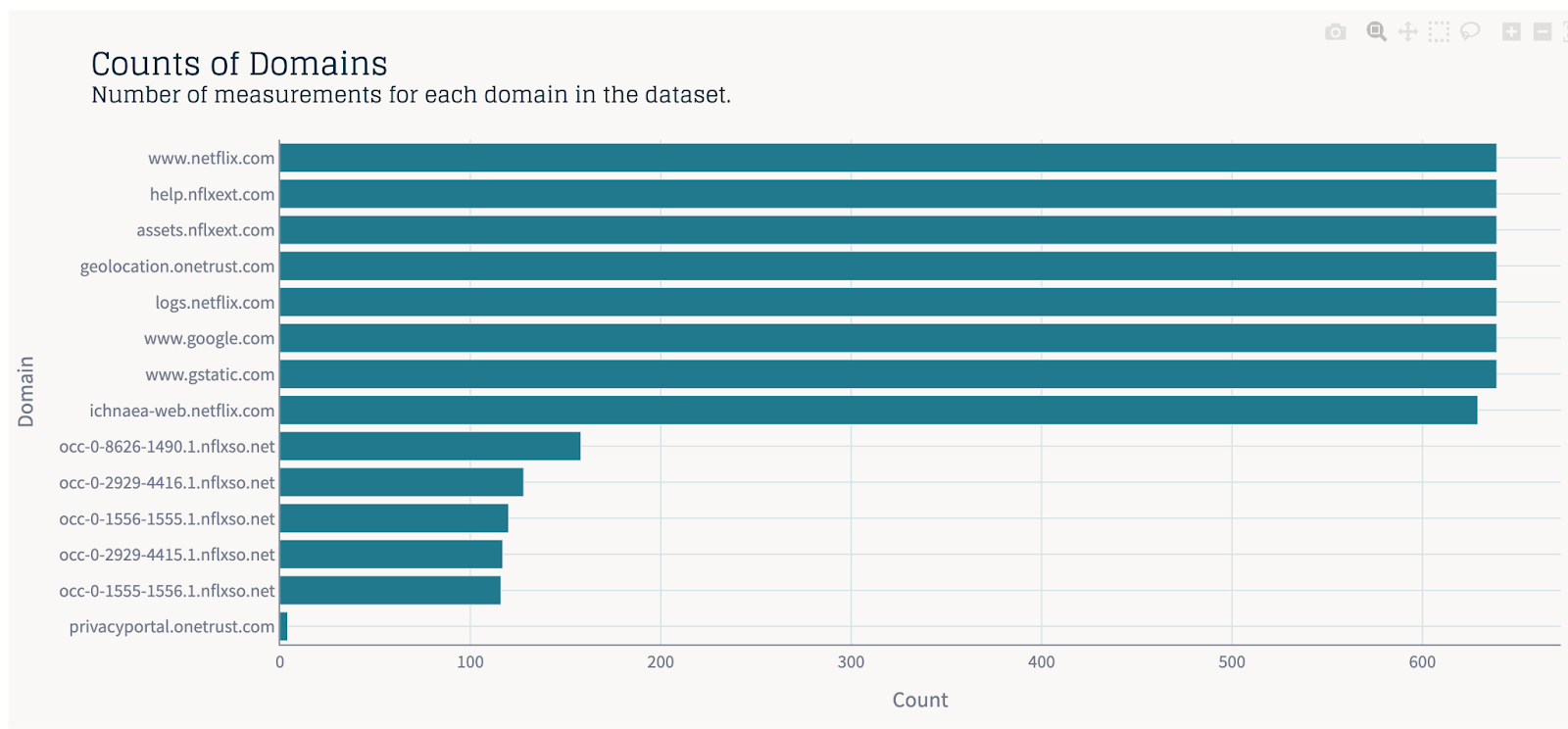
Counts of Domains used for loading netflix.com
This graphic already shows that there’s more than one domain involved in loading a website. Most of these domains apparently belong to Netflix directly (such as nflxext.com or nflxso.net), but others are owned by third parties (onetrust.com or google.com). Each of those domains loads something vital to the buildup of the page itself. In the above example, nflext.com serves image assets. onetrust.com manages cookies, and google.com serves a CAPTCHA, if required.
Why these different domains? Imagine a popular website or streaming service based in, say, California. If a user in Austria wants to access it, their requests would traditionally have to travel all the way across the Atlantic and North America to the origin server and back. This physical distance introduces latency — a delay that translates directly into slower loading times.
CDNs solve this problem by creating a geographically distributed network of servers. These servers, often called “edge servers” or “Points of Presence” (PoPs), store copies (or “cache”) of the website’s content, such as images or JavaScript files. When a user tries to access the website, they are automatically directed to the CDN server that is geographically closest to them (or faster to reach). This drastically reduces the distance the data has to travel, leading to significantly quicker load times. But it’s not just about speed. CDNs can also help handle traffic spikes: by distributing the load across many servers, CDNs prevent the origin server from being overwhelmed during periods of high traffic.
This alone is nice to know, but you can already glean the different domains from a simple view of the Network activity in Chrome’s DevTools. What we really want to know is how the mix of domains might impact QoE. Read on to find out how the CDN Analysis tool helps you do that.
Connecting the User Experience and Slowest CDNs
Ever wondered how much a single sluggish resource can drag down the entire user experience? Metrics like First Contentful Paint (FCP) are critical for web performance, and they’re often dependent on the slowest component in the request chain. Typically, FCP suffers when primary assets like JavaScript files have to be pulled from a separate CDN. We consider FCP as one important web QoE metric, but there are others (and we’ll talk about them later in this post!).
Our new dashboard allows you to directly correlate FCP with the slowest request times for the various domains your users are accessing. This view makes it immediately obvious if particular services or CDNs are consistently creating bottlenecks that impact how quickly content appears for your subscribers. If one CDN serving critical images is slow, your FCP will go up, even if the rest of the page elements load quickly from other, faster CDNs.
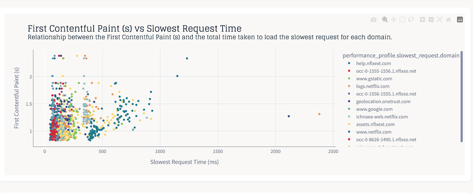
First Contentful Paint (s) vs Slowest Request Time broken down by CDN
This scatter plot shows the relationship between First Contentful Paint (FCP) and the total time taken to load the slowest request for each domain, here for the example of loading the https://netflix.com URL. Each color represents a different domain, helping to identify CDNs that might be contributing to higher FCP times due to slow individual requests.
Imagine a straight line from the bottom left to the top right corner. Any points occurring in the left upper triangle indicate that there are CDNs whose larger request time (further to the right) cause a larger FCP value (further up). In our case, the blue-ish dots come from netflix.com itself, hence, we can conclude that optimizing that path should result in better FCP values, and that asset CDNs are not the main culprit.
Performance by Domain and Client Viewpoint
Performance isn’t always uniform. An issue affecting one set of users might not be visible to another, because the user might use a different geographical location (and thus, different CDN endpoints), or a different type of Internet access product.
That’s why granular analysis is key. With Surfmeter’s “Slowest Requests Distribution” view, you can now dissect performance on a per-domain basis and even see how it varies across different measurement clients.
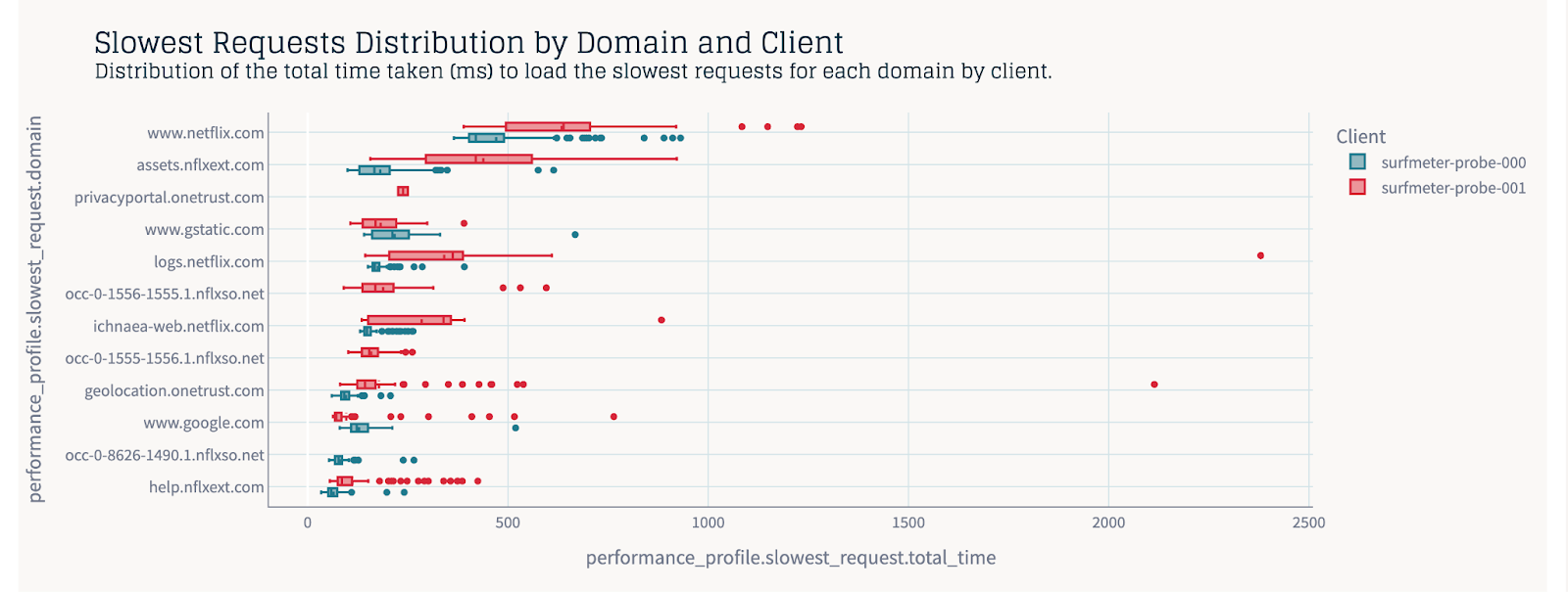
Slowest Requests Distribution by Domain and Client
This box plot displays the distribution of total time (ms) for the slowest requests, broken down by domain and the specific client making the measurement. It’s a fantastic way to spot if certain domains are inherently slower for some clients but not for others, or if a domain itself is generally performing worse.
For ISPs, this is invaluable. Are users in a particular region hitting a poorly performing CDN edge? Are specific peering points struggling? Or is the fact that a client is only connected with DSL making a huge impact? This chart helps you start asking the right questions.
For instance, we see that our Probe 000 has a consistently better loading experience than the Probe 001 for https://netflix.com — it is explainable by the difference in access product (Probe 000 is a 300 MBit/s fiber connection; Probe 001 a 100 MBit/s cable connection). However, we also notice significantly more outliers for Probe 001, indicating connection/stability issues that go beyond pure bandwidth.
Getting Granular IP-Level Performance Statistics
Sometimes, you need to go even deeper – right down to the individual IP addresses serving content. Our “IP Performance Analysis” chart provides a compelling overview.
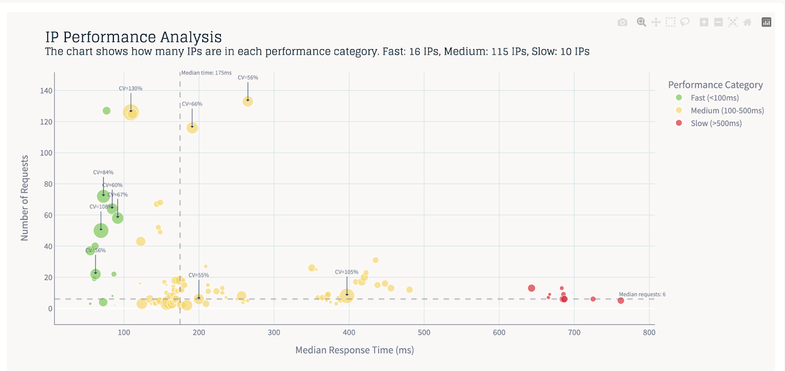
IP Performance Analysis
This scatter plot maps the median response time against the number of requests for individual IP addresses. Points further to the right mean requests are slower. Points at the top of the chart mean they are used a lot. IPs are color-coded by performance category (Fast, Medium, Slow), and the size of the bubble can indicate variability (like the Coefficient of Variation – CV). Annotations highlight key metrics, making it easy to identify problematic IPs, and from which Surfmeter measurement they come.
Here, you can quickly identify underperforming IPs. Are they consistently slow (high median response time)? You will find them in the right half of the chart. Are they erratic (high CV%)? Then their bubbles will be bigger. How many requests are these domains handling? The further up, the more important they will be. The chart even gives you a quick summary, like “Fast: 16 IPs, Medium: 115 IPs, Slow: 10 IPs,” offering an instant snapshot of the health of the IP landscape you’re analyzing.
Of course, we also provide lookup tables for the involved Autonomous Systems (ASs). This means that problematic IPs can be mapped directly to the ASs involved. This kind of insight is important for understanding if issues lie with specific servers or network paths.
Deep Insights with HAR Timings
Beyond the high-level metrics, it’s often essential to understand where the time is being spent during a request. Surfmeter leverages HAR (HTTP Archive) data to break down each request into its constituent timing phases. This includes:
- DNS Lookup: Time spent resolving the domain name to an IP address.
- Connecting: Time taken to establish a TCP connection to the server.
- SSL/TLS Handshake: Time spent on the secure connection setup.
- Waiting (Time to First Byte, or TTFB): Time spent waiting for the server to send the first byte of the response after the request is sent. This is a critical indicator of server-side processing speed.
- Receiving: Time spent downloading the actual content of the response.
Our dashboards allow you to visualize these HAR timing aspects, e.g., in box plots. This lets you see, for instance, if DNS resolution is a common bottleneck across many domains, or if specific CDNs have a consistently high “waiting” time, suggesting server-side issues on their end. Understanding this breakdown is key to pinpointing whether slowdowns are due to network latency, server processing, or connection setup overhead.Consider the following chart, where we show selected HAR timing aspects for some domains of netflix.com:
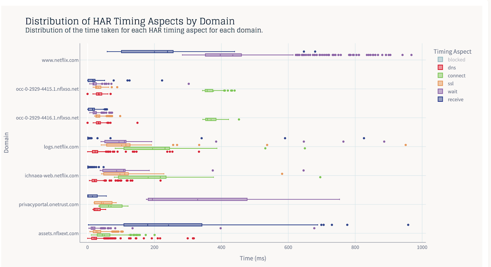
HAR Timing Aspects for netflix.com domains
You can clearly see the impact of just having to wait for the server to process your request, and receive the corresponding data for the main domain (netflix.com, at the top). Other domains, however, like nflxso.net, require a significantly longer time to connect, with an average just shy of 400ms. Moving down to onetrust.com, the fact that some third party entity is managing cookie consent adds another average 300-400ms of wait time to a fully interactive page.
What Are the Key Web Performance Metrics?
Since we mentioned FCP above, we want to be clear that this is not everything that matters. Determining the quality of a website load event is tricky, as it depends on what it is that you want to measure. Let’s quickly touch upon some of the key metrics Surfmeter helps you track in the web browsing domain. Understanding these is important for pinpointing performance bottlenecks:
- Document Ready Time: This metric indicates when the HTML document has been completely loaded and parsed, meaning the browser knows about all the elements on the page, even if they haven’t all rendered yet. It’s an important milestone for interactivity, but in the case of complex websites, not directly correlated to user experience.
- Page Load Time (PLT): This is the classic metric representing the total time it takes for a webpage to load completely in the user’s browser, including all images, scripts, and stylesheets. While comprehensive, it doesn’t always tell the full story of perceived speed. Some websites may have a high PLT, while already appearing to be loaded to the user.
- First Contentful Paint (FCP): FCP measures the time from when the page starts loading to when any part of the page’s content is rendered on the screen. This could be text, an image, or even just a background color. It’s a key indicator of when the user first sees something tangible, signaling that the page is actually loading.
- Largest Contentful Paint (LCP): LCP marks the point in the page load timeline when the main content of the page has likely loaded. Specifically, it measures the render time of the largest image or text block visible within the viewport. A good LCP helps reassure the user that the page is useful.
We wrote about these metrics in a previous article of ours, so if you are curious about them, we’ll refer you to that post.
What’s important is to note that both the more technical metrics as well as the more user-focused metrics come in handy when quantifying performance and QoE — you essentially need both types. Monitoring these metrics in conjunction, you get a clear picture of a website loading experience.
Some Background: How The CDN Measurements Work
With our new CDN Analysis feature, we leverage the fact that Surfmeter can trace network requests for its browser-based measurements — both for video streaming and regular web browsing. We capture the requests while the measurements are running, store them temporarily on-disk, and aggregate them on-device. A report is generated, which contains a description of a single website loading event, including a summary of all CDNs involved, and their request timings.
In particular, Surfmeter tracks the slowest requests per domain/CDN. This is what we assume to be a possible culprit when the overall loading time goes up. In our typical measurement setup, we measure 10 to 15 popular websites for a given country, at least once per hour, but ideally more often. And if the quality/performance of the overall loading experience is bad, we want to attribute that to a particular CDN. By knowing which CDNs are involved, what their performance is, and how they impact the general page load sequence, we can help operators optimize their peering against those CDNs.
The enhanced network performance reporting is an opt-in feature for Surfmeter, as we are rolling it out across our set of probes.
Why This CDN Tool Matters for Network Providers
These new CDN analysis capabilities in Surfmeter aren’t just about pretty charts; they’re about empowering you to:
- Troubleshoot Faster: Quickly narrow down the root causes of slow loading times and poor video QoE by seeing which CDNs or even specific IP addresses are the culprits, and understanding which phase of the request (DNS, TTFB, etc.) is causing the delay.
- Optimize Your Network: Make data-driven decisions about CDN selections, peering arrangements, and traffic management. If a CDN consistently underperforms for your user base, you have the evidence to discuss it with the content provider or reroute traffic.
- Monitor Proactively: Identify degrading CDN performance before it escalates into widespread subscriber complaints.
Enhance Subscriber QoE: Ultimately, by ensuring smoother, faster content delivery from the multitude of CDNs that make up the modern web, you’re directly improving the Quality of Experience for your users.
What’s Ahead
The CDN Analysis tool marks just the beginning of our journey to help operators detect and solve network issues that affect their customers. Loading websites is a terribly complicated subject, and in our next iterations, we will improve the tool to look at critical request paths — the sequence of network requests that determine the final page load time.
At AVEQ, we’re committed to providing the tools you need to stay ahead in the complex world of digital service delivery. This new CDN Analysis tool is another step in our mission to help you ensure top-tier performance and reliability for your customers. We’re currently rolling it out for interested customers — why don’t you give it a try? Get in touch with us today!

